Contenido del artículo
“It is blue.”
In the gem trade, that is about the least useful sentence you can say. Two sapphires can both be blue, and one is worth $400 while the other is worth $40,000. Same word, a hundredfold difference in price.
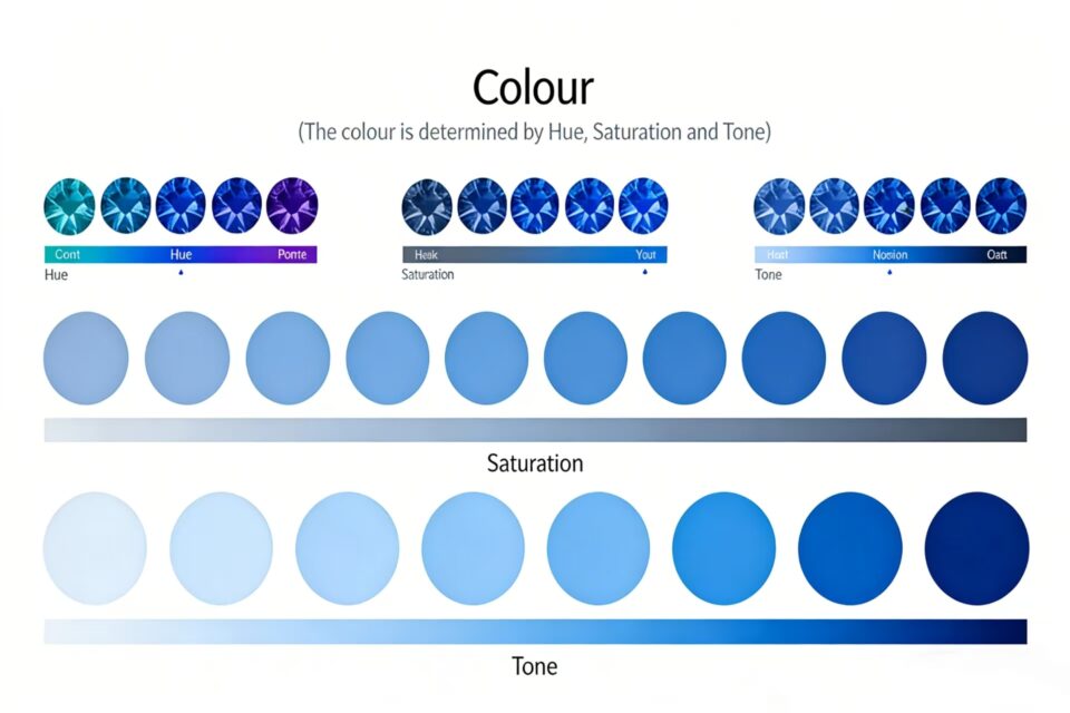
So professionals don’t say “blue.” They use three words instead: hue, tone and saturation. Once you understand them, you can look at almost any colored stone and describe it the way a gemologist would. You’ll also understand why prices vary so much between stones that look similar in a photo.
Here’s how each one works.
Hue: What Color Is It, and Which Way Does It Lean?
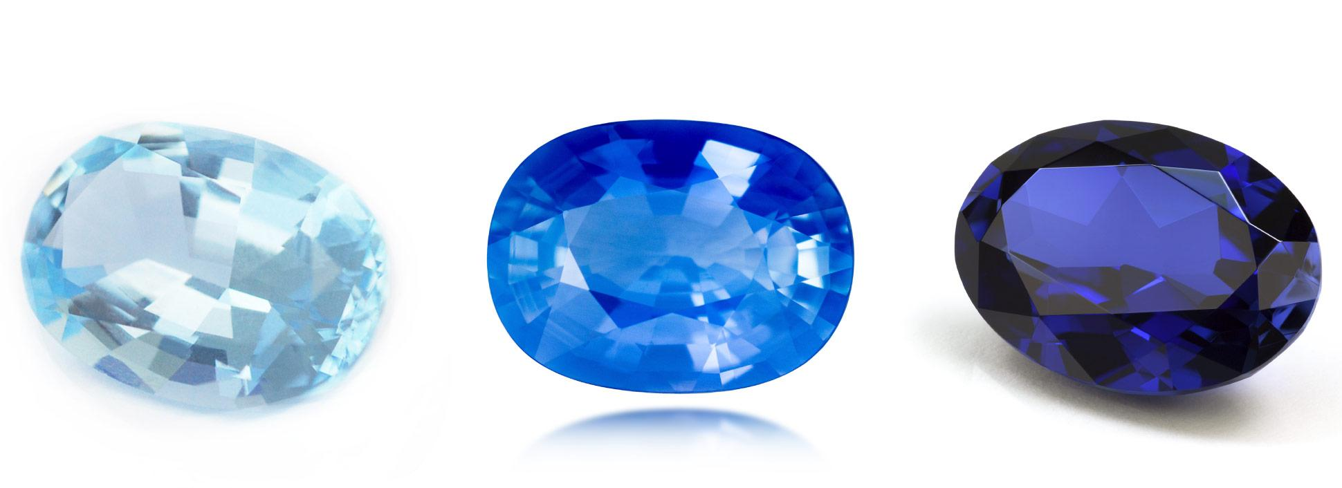
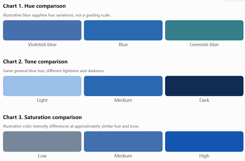
Hue is simply the color itself: red, blue, green, yellow and so on.
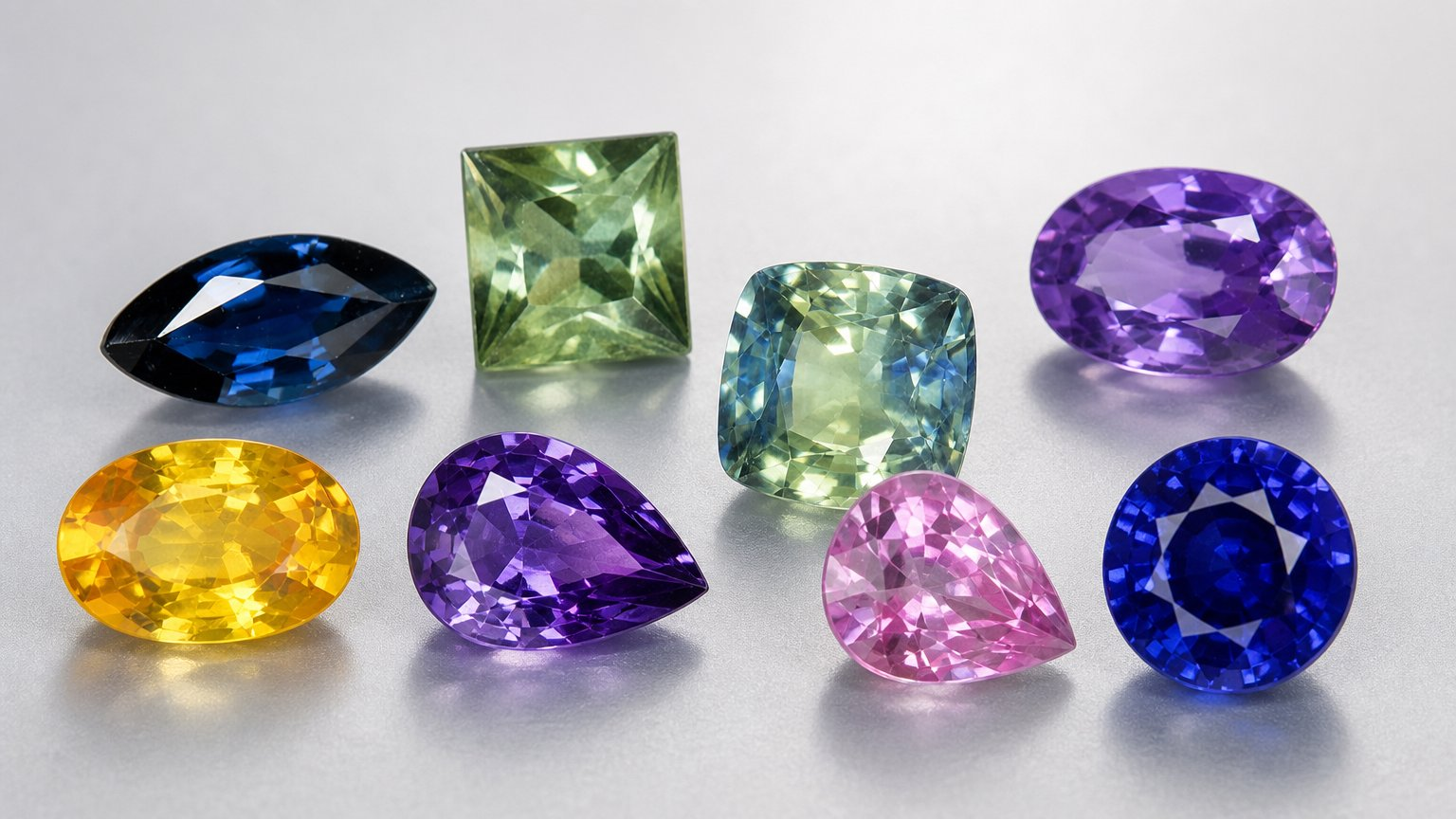
The catch is that almost no gemstone shows a single pure hue. A blue sapphire is rarely just blue. It’s usually blue with a hint of green, or blue with a hint of violet. A ruby is red leaning purple, or red leaning orange.
In the trade, that secondary shade isn’t a minor detail. It’s part of how the stone is described, and it changes the price, sometimes by a lot.
A quick note on the table: preferences vary slightly by market and by buyer, so treat it as a guide to the general trend, not a fixed rule.
Tone: How Light or Dark Is the Color?
Tone describes how light or dark a stone looks, from very pale to nearly black.
Two stones can have the same hue and the same intensity and still look completely different. One is a pale sky blue, the other a deep navy.
Here’s the trap: neither extreme is better. Every gemstone species has a sweet spot.
Too dark, and the stone loses what we call life. It looks flat and stops returning light to your eye.
Too light, and it looks washed out, almost like colored glass.
For blue sapphire, the stones buyers compete for are medium to medium-dark. That’s where the color feels rich without swallowing the light.
Saturation: How Pure and Intense Is the Color?
Saturation is how far a color sits from grey. It’s the most important of the three when it comes to price.
A highly saturated stone looks lit from the inside. A low-saturation stone looks muted, dusty and slightly greyish, even if the hue is exactly right.
And this matters for your wallet: saturation beats size. A vividly saturated two-carat stone is worth more than a pale five-carat stone of the same species. Every time.
Many buyers focus on carat weight first because it’s an easy number to compare. But a large stone with weak color is just a large, weak stone.
Putting It All Together
Here’s the whole idea in one line each:
Hue: what color it is, and which way it leans.
Tone: how light or dark, and every species has a sweet spot.
Saturation: how intense, and this is the one that drives price.
A Simple Workflow for Evaluating Any Colored Stone
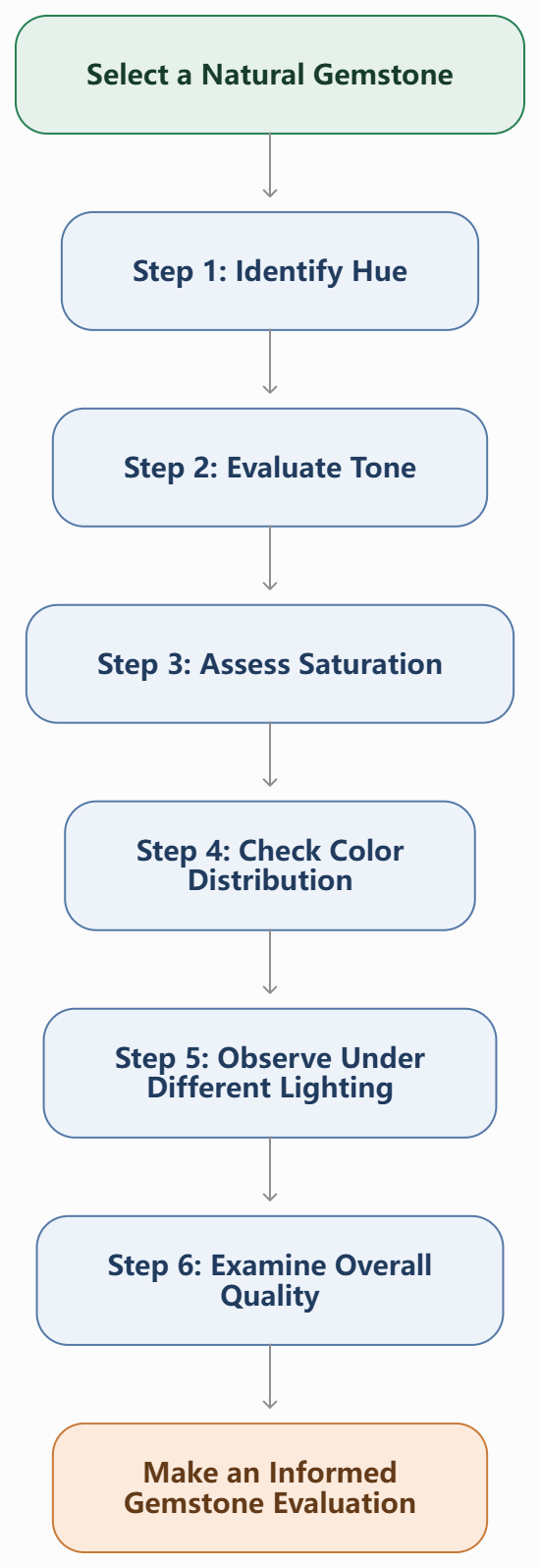
You don’t need a laboratory to do a first-pass evaluation. Try this order:
STEP 1: Move to a window
↓
STEP 2: Check HUE
What color? Which way does it lean?
↓
STEP 3: Check TONE
Too pale? Too dark? Or medium to medium-dark?
↓
STEP 4: Check SATURATION
Does it glow, or look grey and dusty?
↓
STEP 5: Re-check under a normal indoor bulb
↓
Still looks good in daylight AND indoors?
├── YES → Strong candidate. Ask for a lab report.
└── NO → Walk away, or ask for a better stone.
One Warning: Never Judge Color Under Jewelry Store Lighting
This is the most practical advice in the whole article.
Display lighting in shops is designed to make stones look their best. That’s fine for the shop, but it isn’t how you’ll see the stone day to day.
So take the stone to a window. Look at it in daylight, then under a normal indoor bulb. If it still looks good in both, it’s a good stone. If the color falls apart once the spotlights are gone, you’ve learned something valuable before spending any money.
Quick Checklist Before You Buy
Can I describe the hue, including its secondary shade?
Is the tone in the sweet spot for this species?
Is the saturation strong, or is the stone grey or dusty?
Did I view it in daylight and indoor light?
Am I choosing color over carat weight?
Ask Our Gemologist, Then Shop with Confidence
Color is easy to see and hard to describe, and that’s exactly where a second opinion helps. If you’re comparing stones, unsure how a hue or tone will look in person, or want help choosing between a smaller vivid gem and a larger pale one, contact our gemologist team and we’ll talk it through with you. When you’re ready to see real stones, browse our collection at shop.oriagems.com and put hue, tone and saturation to work on your next gemstone.
References
Gemological Institute of America (GIA). Colored Stones: Quality Factors and the GIA Colored Stone Grading System (hue, tone, saturation). https://www.gia.edu
King, J.M., Moses, T.M., Shigley, J.E., & Liu, Y. (1994). “Color Grading of Colored Diamonds in the GIA Gem Trade Laboratory.” Gems & Gemology, 30(4), 220–242. GIA.
Hughes, R.W. (2017). Ruby & Sapphire: A Gemologist’s Guide. RWH Publishing / Lotus Publishing.
Wise, R.W. (2016). Secrets of the Gem Trade: The Connoisseur’s Guide to Precious Gemstones (2nd ed.). Brunswick House Press.
Gem-A (The Gemmological Association of Great Britain). Gemmology foundation and diploma course materials on colour. https://gem-a.com
Gübelin Gem Lab. Educational resources on colored gemstone origin and quality. https://www.gubelinlab.com